This case study is to identify issues that could be fixed in order to make the Easyjet website easier to use.
The Problem
Based on the user research it was discovered several pain points on the user journey such as UI inconsistency, price matches, page not easy to find, etc.
The Objective
Redesign a seemless experience that handles end-to-end journey of booking a trip that customers are truly satisfied. Using reserch, interviews, survey, benchmark, journey map, and strategy to redesign a better experience to help customers to book a trip with focus on increasing conversion rates.
Empathise
Lacked understanding in customer wants, needs and expectations:
Current frustrations and pain points
What did they really want?
What did they really need?
Dived into an intensive two-weeks research sprint.
Usability tests
2+ user interviews
Survey
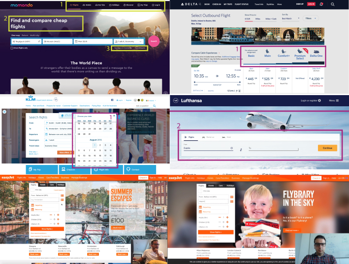
Benchmark and Analyses
User Interviews Outcomes
Cabin bag not clear how many kgs are allowed
Search results page filters aren't intuitive
Contact Page not easy to find
Survey Outcomes
Customer having problems to sign in/sign up with emails from different countries
Prices didn't match on the checkout page
Too many marketing sections - Many clicks to get to the checkout page
Based on the outcomes, I started to prioritise a number of ideas:
Understand key pain points, user wants and needs
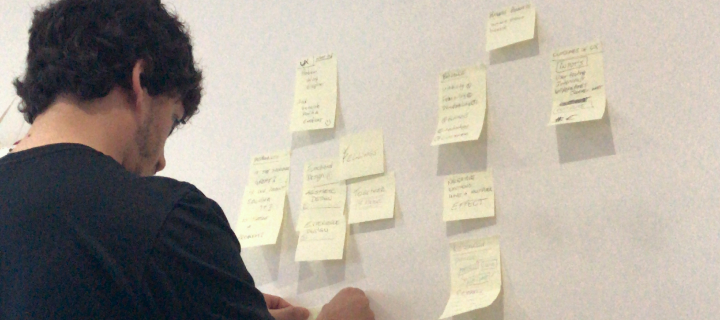
Classify all insights gathered
Create an affinity diagram
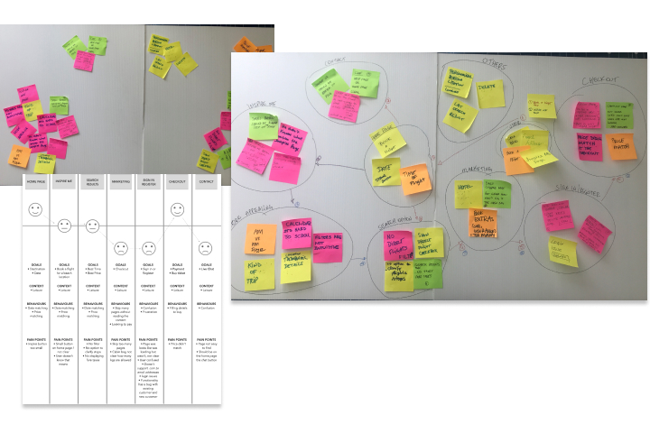
Journey Map Outcome
During this activity was found several pain points especially at Marketing ads, contact and sign in/sign up pages. On this matter I took the approach to improve the user experience and avoid the user to not feel overwhelmed or frustrated, helping them to achieve a goal.
It was discovered a few issues on the Search results page. This allowed me to have a better understanding of the users struggles during the process. As an example, there were no clear options on flight connections and the filters on that page weren't intuitive. Also the flexi fares option is not intuitive, therefore confusing the users.
On the Inspire me page, the user was confused about the page, and didn't understand how to use also there was no back button. For a better user experience I decided to add ”Inspire me” page in a tab beside the ”Search” tab, so the user had the freedom to switch tabs to search or to be inspired. The idea behind the aiport field on the ”Inspire me” page is to automatically identify where the user is located to show flights that avaialble from that airport.
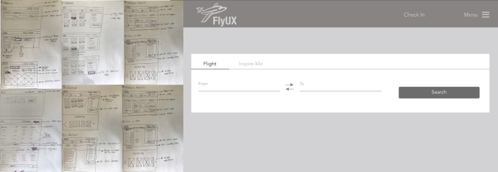
Wireframe / Prototype
In this whole case study, the only focus was the desktop version. Based on the work that has been done so far, I could adjust and improve the user journey and some functionalities in a way that users could feel confident and have less friction to achieve what they are looking for.
I worked using different tools to create the first wireframe, first sketching ideas using pen and paper and afterwards I used Sketch App to refine and polish the wireframes. The final step I used InVision app to prototype and make it live for a user to test the new flow to book a trip.